
Familiarizing ourselves with the health-tech landscape, our team interviewed doctors, patients, professors, students, and parents. While gathering initial user research focused in health care, our team repeatedly found that people were frustrated with the high expenses of health care. At times when it mattered, there was no way of proving that they had been committed to a doctor's recommendations and a healthier lifestyle. On the other end, we found that doctors were frustrated with patient-care processes: were people taking their medication regularly? Making healthy dietary choices? Had they gotten their flu shot or taken preemptive health measures?
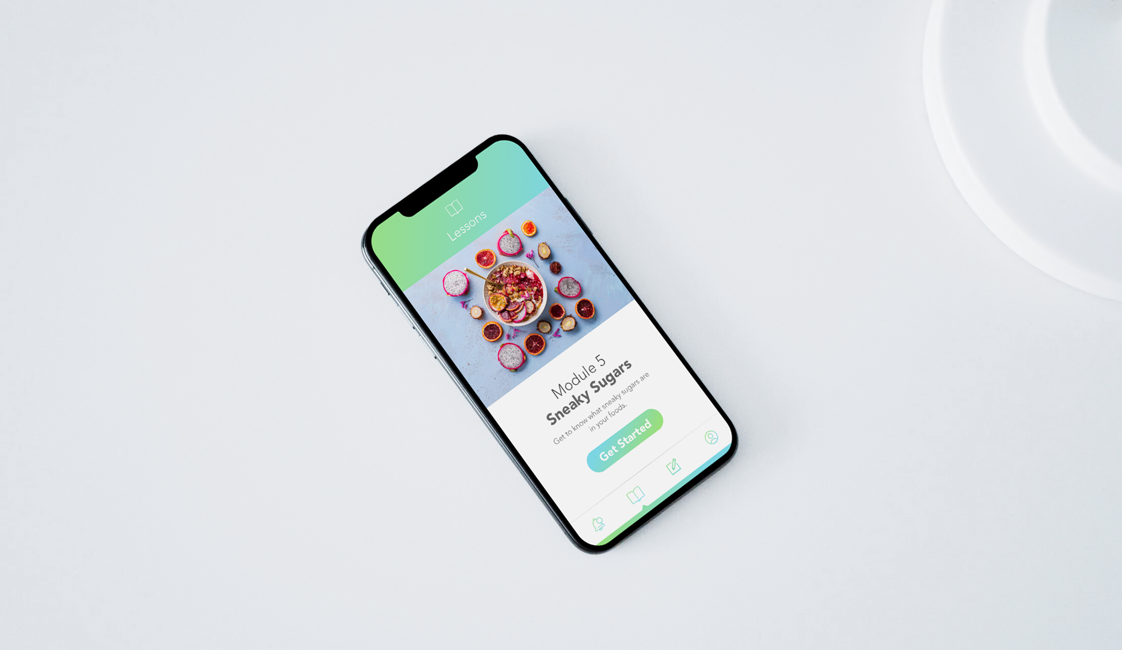
Check-Up is an app that provides lessons for users to learn health information focused on preventable diseases, and incentivizes participation with health care benefits based on their performance on the app. Users can read through well-organized and helpful lessons, take the correlating quiz, then redeem benefits for high scores with their health-insurance provider. These three simple steps would strengthen patient understanding and provide tangible evidence for doctor trust.
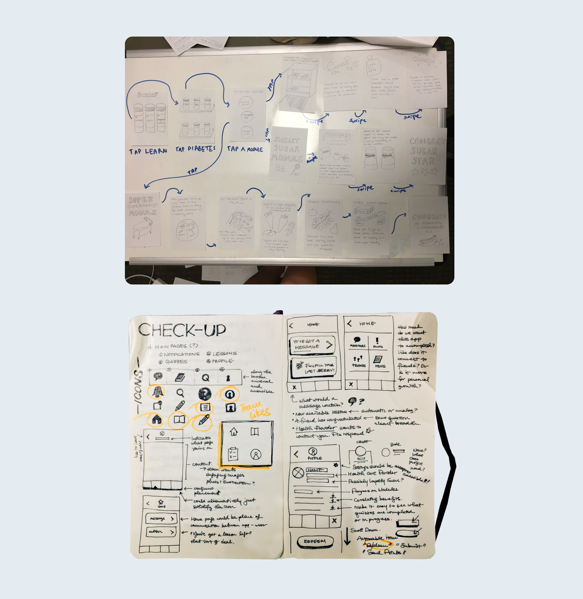
We brainstormed pages and features we wanted to include in Check-Up, then mapped how those would translate to interfaces that flowed naturally and efficiently. We then user-tested prototypes with a dozen people to find dead-ends or difficult areas in the flow, and let that feedback guide later adjustments and iterations. In finalizing our user interface feel and flow, I presented the team with options in wireframes, iconography, typography, and color schemes, narrowing aesthetic options to those that made sense to the product.
My team and I spoke to real women to better answer what women would want to see as their period app. Of the descriptors they provided, we found that these three stood out: informative, direct, womanly.
Some surprises? Pink was a fine color, just not with flowers and butterflies. Refinery 29 has done a remarkable job of branding what "feminine" can look like while still being empowering. Seeing content from other women (ie. learning tips and tricks from your Mom) is considered valuable and better than Cosmo's 20 hacks. Modern chic is very in.
With this feedback in mind, we created moodboards to explore what themes could accomplish these descriptors successfully. We sourced from brands we admired, and took traditionally "masculine" colors to counter the complaints we heard resounding in the internet space.
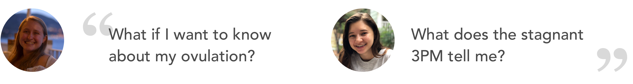
The use case that kept recurring as we began to build the user experience and appropriate user interface was that of the doctor's visit. Every friend, mother, aunt, instructor we spoke to recalled the question: when was the date of your last period? For those unfamiliar, this question occurs somewhere between "when was your last check-up" and "how much do you weigh." An uncanny 100% of the women we spoke to then said they either had to take out their phone or their planner to go back and check the date of their last period. Usually, the person hadn't logged the date of their last period explicitly, but instead would see a meeting or event they remembered they had their period during.
This isn't exactly an accurate method, and for many health concerns, knowing exact dates and symptoms can be extremely helpful or critical. This formed our UI and UX requirements:
- Needs to show a calendar.
- Needs to be directly readable.
- User should be able to view cycle holistically.


The first iteration compiled all our insights with our research and offered three main features: a landing page that informs the user of where they were in their cycle, what that day may entail in terms of hormones and physical requirements, and a calendar that clearly marked when they had had their periods. The design emphasized minimalism and elegance. We tested this against real women and received the following feedback during user testing:
So back to the drawing board. In our four iterations, we confronted the following needs: birth control notifications, contraception-related notifications, detailed but easy onboarding that allows the user to share health-related needs and decisions, ovulation indication, and a birth control reminder. In accessory items, we added some element sizing changes, a manual period toggle, and end page quotes.

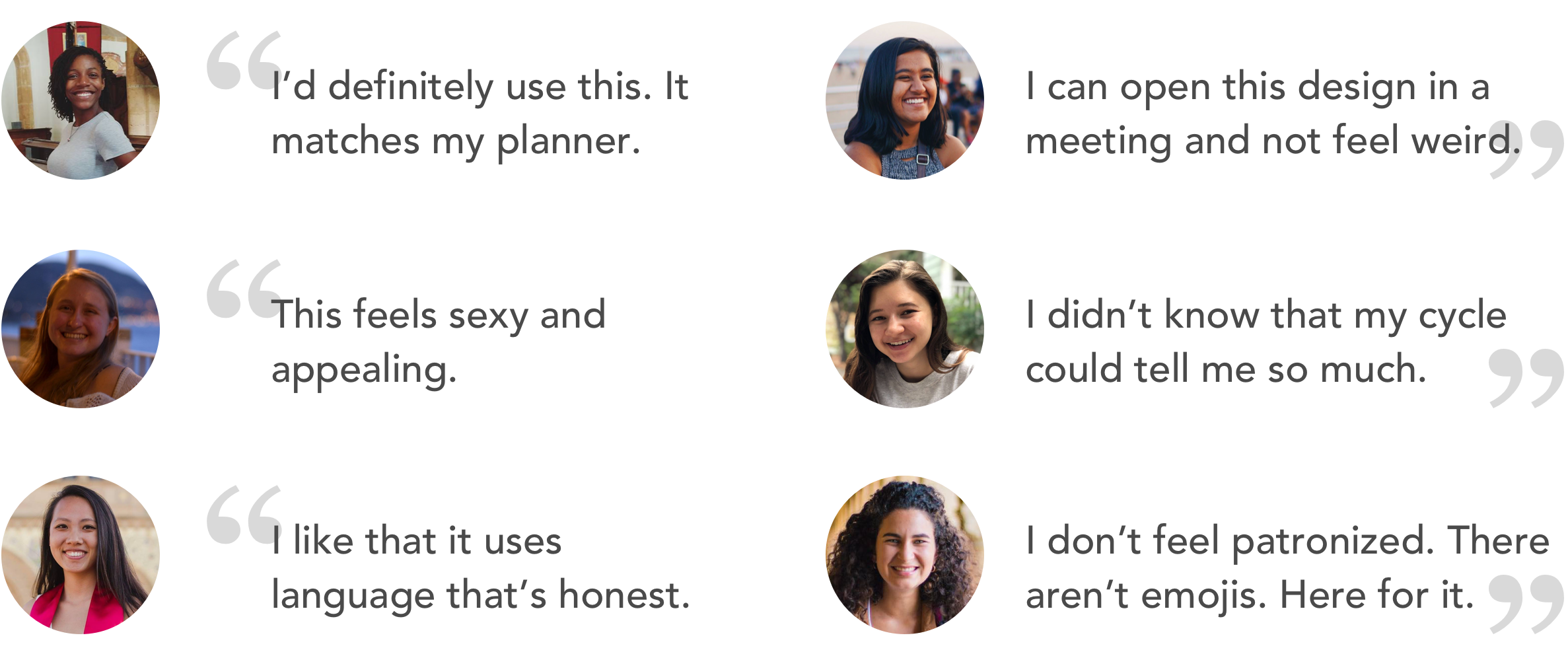
We received incredibly positive feedback to SpotOn's redesign. Women felt that they could open the app in a meeting, unashamed of the taboo around women's menstrual cycles. Women learned more about what their cycle could tell them, such as higher estrogen levels that boost their mood around the eighth day. Women appreciated how the app felt professional and informative, instead of making their body's natural process feel like a gimmick.
This app is currently still a work in progress, and we especially enjoy hearing feedback. Please contact me if you have a story or support to share. We'd love to hear from you.